Next

Your website looks great. It covers everything: your services, your story, your values, your portfolio, your process, your team.
But we've seen founder websites lose qualified leads not because the design was wrong but because a visitor couldn't figure out what to do in the first three seconds. If your site is trying to say everything, it might be saying nothing.
The Problem With Trying to Say Everything
More information feels thorough. More sections feel complete. More content feels like value.
But from a user's perspective? More is often just more confusing.
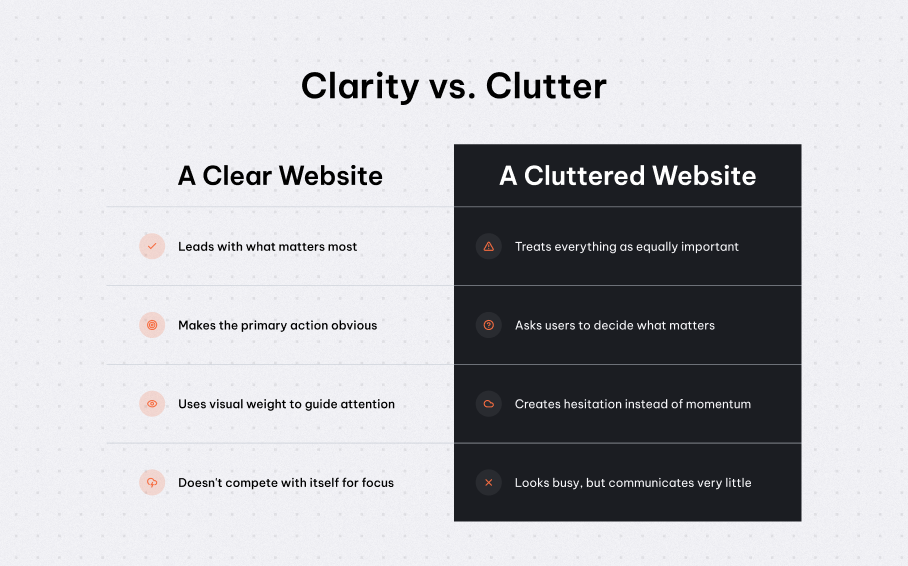
When a website tries to do everything at once, it ends up doing nothing well:
- Visitors don't know where to look first
- The core message gets buried under supporting content
- Clear next steps are replaced by endless options
- The thing you most want someone to do gets lost in the noise
A website without a clear job is just a very expensive brochure. And for founders, that cost is measurable: unclear sites see higher drop-off rates, lower conversion, and leads that quietly exit without ever reaching out.
Every Website Has a Primary Goal
It might be:
- Book a call
- Submit an enquiry
- Make a purchase
- Sign up for something
- Trust you enough to come back
Everything on your website should support that goal, or at least not work against it.
The problem is that most websites are built by adding things, not removing them. And the more you add without a clear priority, the harder your site has to work to communicate.
Clarity Isn't Minimalism. It's Hierarchy!
This isn't about stripping everything back. It's about making sure the right things are in the right place, with the right emphasis.
A website is essentially your pitch to customers, which means you need to be purposeful with what to put there. It's like when you have too much on a presentation slide, it looks messy and it's overwhelming. Where people get lost is when you over explain. The same can be applied to a website. A better example is like stuffing a sandwich with too many ingredients. Too much and it slips out meaning you as the eater lose out on all the delicious flavor.
The "One Glance" Test
Here's a useful question to ask about any page:
If someone had just one second on this page, what would they take away?
If the answer is "I'm not sure" — that's the problem.
Good web design gives users that one-glance understanding: What this is. Who it's for. What to do next.
Everything else supports that or it shouldn't be there.
Why This Gets Lost in the Build Process
In our experience, clarity doesn't break down all at once. It erodes at specific moments: when positioning shifts three weeks before launch, when too many voices weigh in on the homepage, when the brief grows to accommodate everyone's priorities.
The result is a website that represents all of those inputs equally, which means it doesn't truly prioritise anything.
The best websites are edited, not just designed.
A Clear Website Is a Confident Website
Clarity is not about saying less. It's about knowing what matters most and making that unmistakable.
When your website knows its job, users know what to do. When it doesn't, they leave.
So before adding another section, another feature, another piece of content, make sure you know what your websites job is, what you need it to do, make sure you know it’s intention.
If not, it might be making the job harder.
If your site is at that crossroads with far too much to say and not enough clarity on what matters most, that's exactly the kind of problem we help founders work through.