.svg)
Next
Your work as a designer is done: you’ve fine-tuned the website layout; you’ve finalized your design system; you’ve got your assets locked and loaded, all approved and ready for takeoff. It’s finally time to sign off and move on to the next, right?
Wrong! The job has arguably just begun. Figma is the blueprint: your ideas have been perfectly laid out, curated from concept to a 2-dimensional creation. But the design is just that — it’s the idea, the static layout that now needs to metamorphosize into the build it represents.
It’s the process of taking a Figma design and turning it into a fully functional, responsive website that works across devices, browsers, and real-world content conditions.
Let’s switch lenses to a build perspective and take a wide-eye look at what you need to take into account to bring your website to life. Whether you are involved in the build process or not, understanding the differences between a static layout versus the dynamic system that is your website could reduce revisions and iterations, manage expectations, and achieve the result you intended.
The bottom line is: designs are fixed, websites are fluid. This is the core difference in Figma vs website build.
“But what do you mean?”, you say. “I designed for desktop and mobile and even created this prototype for build handoff.”
As true as that is, you’d have to design for each and every screen size in order to match the fluidity of a real website — far beyond the handful of presets provided in Figma. While designing for desktop, mobile, and tablet is the foundation of responsive web design and build, there is a lot more variation in reality (for example, how often is your browser actually fullscreen and not cropped to one side of the screen).
When building your website, you ultimately have to make sure that the design translates to any screen size it might be viewed on. This means working with an almost unlimited number of viewports, where layouts shift, text wraps differently, spacing changes, elements stack, resize, or are replaced by more workable versions.
Through a build lens, you are looking at behaviour — how elements respond, adapt, and scale to do your design justice. What’s helpful about having a design for desktop and mobile is the ability to bridge the gap between those endpoints and visualize what the in-between layouts might look like.
In a perfect world, the design and website would match 1:1. It would be a game of spot-the-difference impossible to win. It’s a perfectionist’s worst nightmare that, unfortunately, there are factors at play that make this a virtually impossible feat.
Designs usually use placeholders for content, text, and assets. Once you start adding in real content, inconsistencies arise that weren’t accounted for. These inconsistencies aren’t the end of the world — if anything, they should be expected and even treated as opportunities to make your website build more flexible and scalable.
Here are some common occurrences that take your build away from perfectly matching your design:
At the end of the day, you only know what truly works once you see how real content behaves in the design.
A good build isn’t one that looks perfect — it’s one that survives real-world content.
Designers, the wonderful creators they are, work with flair — conceptualizing movement for the build to bring to life.
This movement comes in the form of interactions (hover states, parallax scrolling, button behaviours) or animations (loading screens, carousels, and dynamic elements).
.gif)
These are visual ideas that require build logic and implementation to actually function. While prototyping helps communicate intent, designers are not always aware of the technical limitations or time required to execute these features in a real website build.
Everything has a trade-off in the design–build process. You can build almost anything — but not without cost.
That cost usually affects:
There is always a balance between these factors. A complex animation may impact performance. High-resolution media or video may slow down load times.
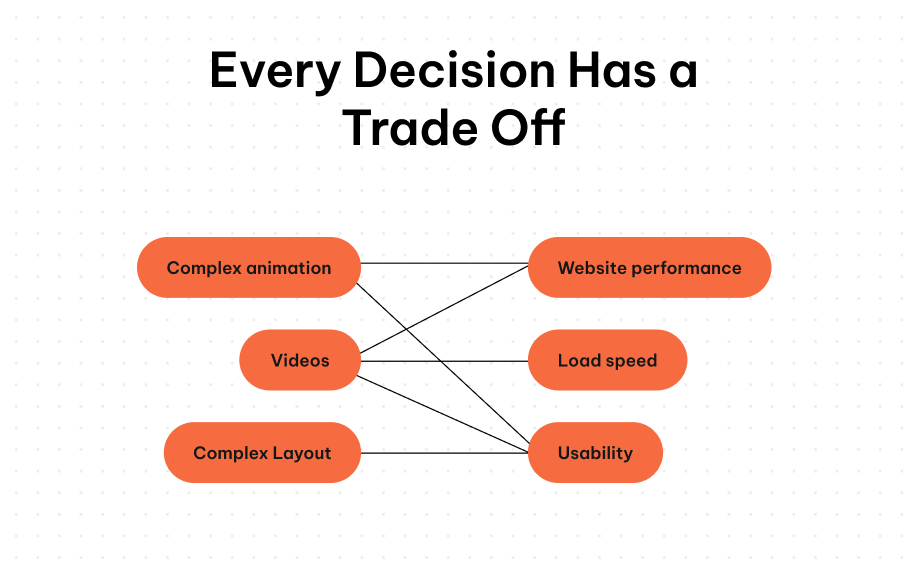
Creating a successful website means making intentional decisions about what matters most — balancing visual design with performance and usability.
By working together in the design phase and collaborating closely during the build, teams can overcome challenges and deliver a fully functional, high-quality website.
Bridging the gap between design and build is what ensures your Figma designs translate successfully into real-world websites — staying on scope, on time, and aligned with your original vision.